Sign up for Prowler Updates
ProwlerPro Dashboards I
Hello everyone. My name is Sergio, one of the engineers of ProwlerPro, the most comprehensive AWS security tool trusted by teams and organizations at any scale. ProwlerPro gives you a holistic view of the security status in your cloud infrastructure with detailed dashboard that you can drill down into. This is the first of a series of videos where we will show you the ProwlerPro dashboards as well as some other great features.
When you get started with ProwlerPro, one of the first things you will see is the home dashboard, which we are covering this video. So let’s go through an example of accessing your results in your very first scan.
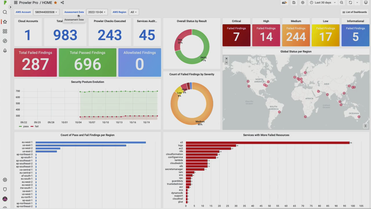
Okay, so right now we are on the ProwlerPro overview page. To go to the dashboards, we have to click either in the dashboard folder or in the results. The first dashboard that you’ll see is the home dashboard, which is the one we cover in this video. In a single glance, this dashboard shows general indicators regarding the security posture of your cloud account.
But first of all, let’s take a look at the filters. This contains dynamic variables, and there are three of them. The AWS account filter lets you choose the counts that you’d like to see the findings, which is going to be useful when we release the multi-account feature. The assessment date, lets you choose the date for which you want to see the result, and the AWS region lets you choose all the valuable AWS regions where you want to see the results.
This filter can have one, more, or all regions. As you can see, the filters are ultimately applied and the dashboard changes. Now let’s repeat the panels. We can see some numerical indicators such as the cloud accounts. In this case, there is only one cloud account since the free tier only allows one AWS account per user. We can also see the total findings, the text executed, and the services that were outdated.
The total findings are broken down based on its status, which can either fail, pass, or allowlisted. This allowlisted status appears because the allowlisted functionality will be available soon in Prowlerpro. This breakdown can also be seen in the overall status by result, by chart, or in the security post revolution time series panel which represents an historic security status.
The time range of this graph can be changed in the top right corner. Let’s change it to seven days. Now you can see that this graph has changed to a seven days period. The failed findings are also broken down based on its severity, which can be either critical, high, medium, low, or informational. This information is also presented in the count of failed findings by severity pie chart.
Remember that all the panels are clickable. For example, you can click on the critical failed findings and see details of those findings. For instance, there is a critical finding since a hardware MFA is not enabled for the root account, and you can see all the information here such as the result extended and the remediation.
This panel allows you to export the results into a CSV or Excel format. To do this, click on the table title and select inspect data on the drill down menu that will appear. Now, the CSV can be downloaded by clicking on the download CSV button. Optionally, the option download for Excel can be activated for using this CSV in Excel.
Okay, so let’s go back to the home dashboard. We can do this by either selecting it on the list of dashboards drill down menu, or clicking on the ProwlerPro logo. The global security status per region panel, shows a dot per AWS region, and gives you an overview of the findings when the mouse hovers over the regions. The color for its AWS region depends on how many failed findings there are.
The color will be green if there are zero failed findings in the corresponding region. This regional occupation is also represented in the count of past and failed findings per region bar chart panel where we can see the total findings per region. The last three panels are bar charts too. First, we have the services with more failed resources, which represents the AWS services with the most failed findings, then the count of any result by service name, which shows the total findings for its AWS service.
And finally, the affected resources by check ID bar chart, which displays the number of failed findings per Prowler check. And that was all. If you have any questions about this task board, please join our Slack group and post it in the Ask a Question channel. Find the link below or at prowler.pro. It was a pleasure having you in this video.
See you soon.

Sergio Garcia
Engineer at ProwlerPro
I’m a Cloud Security Engineer with experience in AWS. Among my roles, I completed an internship at Amazon and supported a digital bank to secure its assets in the cloud. I’m passionate about cloud automation, even more if it helps to ease security management.
Recent Articles
CSPM for GCP: Securing Your Google Cloud Environment with Modern Cloud Security Posture Management
Modern organizations rapidly embrace the Google Cloud Platform for its scalability, innovation capabilities, and cost-effectiveness. However, this digital transformation comes with a critical challenge: maintaining robust security across increasingly complex...

Prowler’s State of Cloud Security Report 2025
https://youtu.be/S8nLoxgrc5o Rajiv Taori and Laura Franzese walk through the findings of the 2025 State of Cloud Security Report We've been in this industry long enough to know that survey data...

Prowler Cloud: The Most Affordable, Effortless Way to Scale Cloud Security
Cloud security should be simple, cost-effective, and able to grow with your business. Prowler Cloud delivers all of this and more, offering the industry’s lowest total cost of ownership and an architecture...